How do you build a sales dashboard that works?
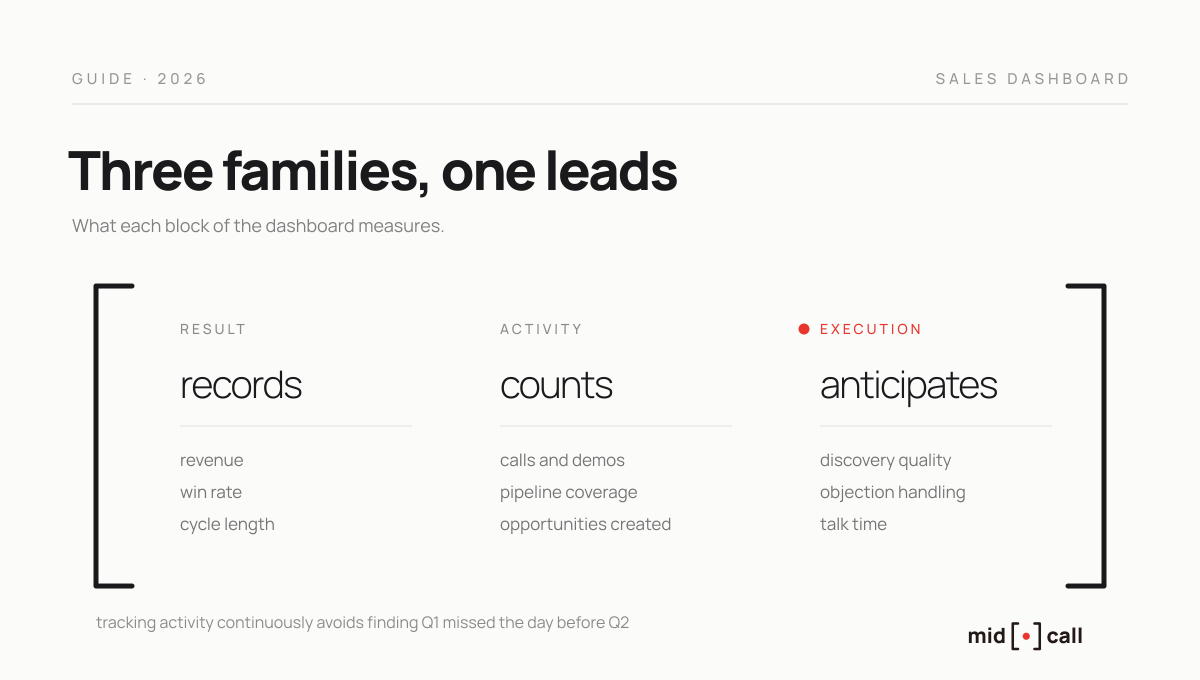
A useful sales dashboard comes down to about ten indicators across three families, results such as revenue and win rate, activity such as call and demo volume, and execution, meaning the quality of what happens inside conversations.
The most common mistake is chasing completeness, stacking a hundred KPIs and then looking at none of them. Here are the indicators that trigger a decision, the tools to track them from native CRM to flexible base, and the line almost every dashboard leaves out.
What is a sales dashboard?
A sales dashboard is a management interface that aggregates the key indicators of sales activity in real time, so a manager can see at a glance what is progressing, what is stuck and what is about to close. It is not a spreadsheet updated on Fridays or a PDF sent on the first of the month, it is a living tool, connected to the data source, checked weekly if not daily.
A useful distinction before going further, because it causes real confusion. A dashboard gives a team and pipeline overview, answering how activity is trending. A scorecard is individual, focused on one rep and their progress toward targets, and serves coaching. The two complement each other, but this article is about the first, managing collective activity.
Which indicators belong on a sales dashboard?
The beginner reflex is to include everything. Some guides list more than a hundred KPIs, and the result is a wall of numbers nobody consults. An indicator earns its place only if a decision fires when it drifts. The right number is around ten, spread across three families.
Result indicators. Revenue or ARR closed, win rate, average deal size, cycle length. They measure the outcome and arrive late by nature, since they reflect conversations that happened weeks earlier.
Activity indicators. Calls and demos held, opportunities created, pipeline coverage. They tell you whether the team produces enough effort, and this is the most underrated family. Tracking activity continuously is the only way to avoid discovering, the day before the next quarter, that the targets will be missed. If your goal is a ten percent increase, a weekly metric tells you by week two whether you are on track, while there is still time to act.
Execution indicators. Talk time, discovery quality, objection handling, next steps locked. They measure what happens inside the conversation, and they are the only leading indicators on the list, the ones that move before results. More on them below, because this is the family almost no dashboard displays.
Here is a starting set, to adapt to your cycle and model.
| Family | Indicator | The decision it triggers |
|---|---|---|
| Result | Revenue closed | Adjust effort or the period target |
| Result | Win rate | Coach closing or revisit upstream qualification |
| Result | Cycle length | Find the stages where deals stall |
| Activity | Calls and demos per week | Restart prospecting before the pipeline empties |
| Activity | Pipeline coverage | Flag when open pipeline drops below 3x target |
| Execution | Talk time | Coach a rep who monopolises, target 30 to 45% |
| Execution | Score per skill | Target each rep's improvement axis |
| Execution | Next steps locked | Fix calls that end with no dated follow-up |
Which tools build a sales dashboard?
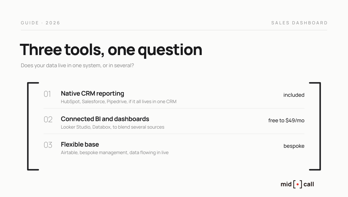
Three families of tools, from simplest to most flexible. The right choice hinges on one question, does your data live in one system or several.
The CRM's native reporting. HubSpot, Salesforce or Pipedrive include a dashboard builder. If all your sales data lives in one CRM, it is often enough to start. Its limits show up fast, and they are documented. HubSpot's builder caps non-table reports at a thousand rows, does not allow custom queries, and makes trend views or multi-KPI dashboards mixing goals, pipeline and hygiene hard to assemble. User reviews regularly note that building clean dashboards there takes time and real ramp-up. In short, native reporting is fine to monitor, and shows its limits the moment you want to blend or visualise finely.
Connected BI and dashboard tools. When data comes from several sources, a dedicated tool takes over. Looker Studio remains the free reference in 2026, with unlimited dashboards and native Google integrations. Databox, a KPI-tracking app you can check on mobile, starts around $49 per month and dropped its free plan in 2025. These tools excel at aggregating and visualising, at the cost of setup time and sometimes a technical layer.
Flexible databases. This is the approach of teams that want full control. A base like Airtable centralises data flowing straight from the sources, and serves as both the dashboard and application layer. You gain total freedom of structure, at the cost of some initial building. It is often the best compromise for a team with clean data that wants bespoke management without paying for an enterprise platform.
Querying your dashboard in plain language
One 2026 shift deserves a place here, because it changes how you consult a dashboard at all. The MCP protocol, an open standard created by Anthropic, lets you connect a CRM or a base to an AI assistant and query its data in plain language. Instead of logging into the CRM to pull a report, you ask the question and the answer arrives in seconds.
Several CRMs, including HubSpot, Pipedrive, Zoho and Close, offer native MCP support in mid-2026, with setup amounting to copying a server URL into your AI client. It is not a replacement for the visual dashboard, still irreplaceable for monitoring at a glance, but a strong complement for the one-off questions that would otherwise mean rebuilding a report each time.
The line almost every dashboard leaves out
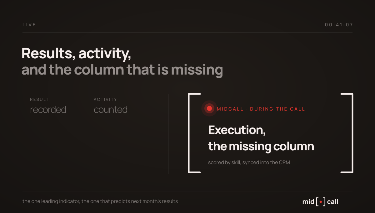
Look at any sales dashboard on the market, it shows results and activity. Revenue, pipeline, conversion rate, call volume. None shows execution, the actual quality of what happens inside conversations, because until recently nobody could measure it other than by ear.
That is precisely the family of indicators that predicts results. A dashboard with no execution column watches win rate fall without ever knowing why, when the cause is in the calls, a rushed discovery, a mishandled price objection, a close that locks nothing.
Midcall fills that missing column. Every call gets a score out of 100, broken down by skill, framing, discovery, selling the value, objection handling and closing, then by dimension inside each. Every score is backed by the exact sentences spoken, with what it would have taken to reach 100. The sales leader then has, per rep and over the period of their choice, the average score, the skills that carry them, the ones costing deals, the objection families encountered and talk time against target. These execution indicators flow automatically into HubSpot, Salesforce or Attio, where your dashboard displays them next to results and activity.
Because the measurement happens live, so does the correction. During the call, the extension surfaces the right prompt at the right moment, tells a smokescreen from a real objection, and tracks qualification against the framework your team runs, SPIN, SPICED, BANT, MEDDIC, MEDDPIC or Challenger. We detail this logic in our guide to sales performance management.
One point of honesty. Midcall is a young product and I will not promise you an improvement percentage we do not yet measure. What the mechanics deliver is concrete, the one family of indicators your dashboard was missing, measured objectively, rep by rep.
Which mistakes should you avoid?
Four come up in almost every team.
Chasing completeness. A hundred-KPI dashboard is not ten times more useful than a ten-KPI one, it is useless, because nobody looks for anything in it. Every indicator needs an owner and an attached decision.
Showing results only. A dashboard that shows just revenue and pipeline warns you too late. Without activity and execution indicators, you record problems instead of anticipating them.
Confusing monitoring with managing. The dashboard monitors collective activity, it does not coach a rep. For individual progress, the scorecard, fed by execution indicators, does the job.
Letting the data rot. A dashboard is only worth the data feeding it. If your reps do not fill the CRM, everything collapses, which argues for tools that fill it automatically rather than relying on entry discipline.
Edward, co-founder of Midcall. Former AE, co-founder of Meteor, a B2B prospecting agency. I write about what actually happens on sales calls, and what the best teams do with it.
Frequently asked questions
What is a sales dashboard?
A management interface that aggregates the key indicators of sales activity in real time, giving a manager an immediate view of what is progressing and what is stuck. It differs from plain reporting by being live and connected to the data source, and from a scorecard by its collective scope, where the scorecard tracks an individual rep's performance.
Which KPIs should a sales dashboard track?
About ten, across three families. On results, revenue, win rate and cycle length. On activity, calls and demos held and pipeline coverage. On execution, talk time, scores per skill and the share of calls ending with a dated next step. The rule is that an indicator stays only if it triggers a decision.
Which tool should you use to build a sales dashboard?
It depends on where your data lives. If everything is in one CRM, its native reporting is enough to start, despite visualisation limits. If data comes from several sources, a BI tool like Looker Studio or Databox aggregates and visualises. And a flexible base like Airtable gives bespoke management when you want full control without an enterprise platform.
Is my CRM's native dashboard enough?
For a team whose data all lives in one CRM, often yes, at least at first. Its limits show up fast, row caps, hard trend views, no external blending without a connector. Many mature teams keep the CRM for operations and add a BI layer or a flexible base for finer analysis.
What is the difference between a dashboard and a scorecard?
The dashboard aggregates team and pipeline activity to monitor, answering how things trend. The scorecard is individual, focused on a rep and their progress toward targets, and serves coaching. High-performing teams use the dashboard to monitor and the scorecard to manage, two complementary tools rather than competing ones.
How do you track call quality on a dashboard?
By adding execution indicators, which classic dashboards do not show for lack of a way to measure them. A tool like Midcall scores each call by skill and feeds those indicators into the CRM, where the dashboard displays them next to results and activity. It is the only family of indicators that moves before results, so the only one you can still act on.
See the live AI coach on one of your calls.
15 minutes. We plug Midcall into a real scenario from your team, you decide.